Monday, May 18, 2015

What LAFC's new stadium means for the LA Galaxy

Today MLS expansion franchise LAFC announced their intentions to build a soccer specific stadium in Exposition Park, on the former site of the Los Angeles Sports Arena. At a cost of $250 million dollars, it will have a capacity of 22,000 seats. At its completion it will be the first open air stadium built within the city of Los Angeles since Dodger Stadium. Permitting and construction will take more than two years, pushing LAFC’s entry into the league back to 2018.


The point about construction in the city of Los Angeles isn’t just public relations. Since Dodger Stadium was built, many teams have played within the city of Los Angeles only to leave for a stadium somewhere else.


Los Angeles Angels left for Anaheim, Los Angeles Chargers left for San Diego after only a year, Los Angeles Rams left for St. Louis, and the Los Angeles Raiders went back to Oakland. The Los Angeles Galaxy leapfrogged over the city going from Pasadena to their own stadium in Carson. UCLA ditched the Coliseum for the Rose Bowl. The Dodgers own their stadium and USC has nowhere to go, so until now they’ve been the only open-air sports teams inside the borders of the city of LA.


The Los Angeles Sports Arena that LAFC will replace with their soccer-specific stadium had its own experience with the flakiness of LA sports. Jack Kent Cooke built the Fabulous Forum in 1967 for his recently purchased expansion Kings, moving the Lakers out of the Sports Arena in the process.


This cost the Sports Arena its hockey tennant, the WHL Blades (who didn’t draw very well anyhow). They’d try again with the Los Angeles Sharks of WHA, which lasted two years. It’s ABA tennant the Stars moved in after the Lakers left and lasted two years. The Clippers came in the mid-80s, but were a doormat until they moved into the Staples Center. UCLA and USC both called the Sports Arena home at one point, but both opted instead for on campus arenas.


AEG worked some magic building the Staples Center Downtown, but they chose to build their soccer stadium in Carson. Built on the site of a 1984 Olympic cycling venue, the now StubHub Center serves not only the LA Galaxy but US Soccer, the US Tennis Association, and up until this season a second MLS tennant in Chivas USA.


In that way it’s quite similar to Staples Center which houses the Lakers, Clippers, Kings, Sparks, and at one point even an arena football team. For indoor arenas, which have lower capacities but year round functionality, sharing is the norm. Conversion from one sport to the other can be done in an afternoon.


Ultimately my thoughts on LAFC’s stadium are filtered through the Galaxy’s needs, specifically, is LAFC’s stadium a legitimate salvo in a battle which hasn’t even officially begun? In trying to organize my feelings I read a bunch of economics articles which used math I couldn’t understand. Outside of the math, what they’re dealing with is supply and demand.


Attendance Per Game
Capacity
A/C%
LA Galaxy 2014
21,258
27,000
79%
2013
22,152

82.04%
2012
23,136

85.69%
2011
23,335

86.43%
2010
21,437

79.40%


The StubHub! Center is built at a greater capacity than there is demand for Galaxy tickets. It was built at well above the average attendance the Galaxy saw in the cavernous Rose Bowl. This has kept ticket prices relatively stable over the history of the complex, but it has also dampened the demand for season tickets. Getting Galaxy season tickets comes down to preference for a specific seat, as getting in day of game is rarely an issue.


This hurts the secondary market value of tickets. It’s common practice for season ticket holders to subsidize the tickets by selling off extra seats for high demand games, but outside of Fourth of July there just isn’t a guaranteed Galaxy sellout.  


Games at less than 1/3 Capacity
Games at 1/3 - 2/3 Capacity
Games at 2/3 Capacity and Above
Games at 90% Capacity and Above
LA Galaxy 2014
0.00%
17.65%
82.35%
23.53%


While the Galaxy don’t sell out, attendance is incredibly stable. Referring to a chart in a CIT Social Science paper from 1974, while the percentage of games at 90% capacity is below an average ABA franchise in 1974, the games at ⅔ capacity or better rival the NFL of that time. Factor in the fact that the games below ⅔ were all weekday games, which carry their own restraints at the StubHub! Center, and you see just how consistent the Galaxy draw is.


I’d conclude that the 27k capacity of the StubHub! Center wasn’t done with the Galaxy in mind. It was done for the national teams, to host World Cup qualifiers, Gold Cup games, Olympic qualifying tournaments, and friendlies.


Which returns me to my original question, is LAFC’s stadium going to impact the gate for the LA Galaxy. We know Chivas USA didn’t have much of an effect on Galaxy attendance, but that was a franchise which required the exact same effort to follow as the Galaxy.


Another paper I read from UNC uses the example of two competing restaurants across from each other, each serving seafood. One is at capacity every day during peak hours and doesn’t take reservations, while another offers comparable food and service at a slightly higher price but has many empty seats. In this example, why doesn’t the popular restaurant raise its prices slightly higher?


This paper, long before Yelp existed, argues that demand for some goods is dependant on the demands of other consumers. Think about how crazy some restaurant owners go over their Yelp reviews. Emotional attachment is harder for economists to quantify, but what if some goods are in high demand because other people want them and not because of price or quantity?


In the case of the Galaxy and Chivas, while the community around LA has held steady and kept the same group coming back year after year, once popular opinion turned on Chivas they literally couldn’t give tickets away. The product didn’t matter, they had a bad reputation.


This might explain some of the scorched earth policy LAFC has had with elements of Chivas USA. While LAFC has been taken to task for allowing a talented youth program to get absorbed by the Galaxy when they could have claimed it as their own, the very brand aware folk at the center want nothing that will be a callback to the former MLS club.


So what is the identity of this brand new club? Thus far, what they are is not-the-Galaxy. Galaxy are blue, they are red. Galaxy are suburban, they’re building in the city. It’s the same strategy NYCFC has employed. They too came in without building a youth structure, because their entire hook boiled down to being blue while they were red. Why take the time to go out to New Jersey? We’re a soccer team in New York.


The Galaxy base isn’t at risk. For that some-20k strong core, the investment is in the Galaxy. LAFC is going after that other 7k, who show up for fireworks or when LA plays the Sounders, or for a national team friendly. Don’t drive from Echo Park, Santa Monica, Burbank, Pasadena, the Valley, down to see the Galaxy. We’re so much closer, and we’re way cooler. We’ll have food trucks and show outdoor movies, and all the things you young kids and your new families like.


That’s where that 22k capacity comes in. They aren’t building for the occasional national team game, or the possibility of landing a bowl game. It’s opening up in a completely different part of town, and they’re going to look for a different core, and they’ll work hard to keep it.


LAFC isn’t the restaurant across the street. That was Chivas USA, and economics took its course. LAFC is the restaurant across town, which with the right yelp reviews will take away the folk who were willing to drive out of their way just to have the experience you offered.

How does the StubHub! Center compete? Go all-seater, reduce capacity. Make it an in-demand ticket more than twice a year. Make it something people need to plan ahead for. There’s going to be a bump with Steven Gerrard comes over, but how do you keep those people? They didn’t stick around with Beckham. After that initial full year, it went right back to that core. Do something to make life better for that core, instead of chasing the capacity which is too big for the club anyhow and always has been.  

Sunday, March 15, 2015

Old Navy jeans and whimsical Americana

It's only recently that I've begun thinking critically about my sense of style. I knew looking good was better than the alternative, but there wasn't too much investment in how or if I got there. Looking back, my biggest influences weren't at all high fashion. When I sought to get away from the free pile at my vegetarian themed co-operative student-housing, it was thrift shops and a dab of surplus store that defined my day to day look.

If one were to combine this with my Los Angeles upbringing, plus a surprising amount of nostalgia, the result is something I didn't know was called whimsical Americana. I didn't know that was my aesthetic until I read an article on Emily Current and Merritt Elliott (link) where they described their style with that phrase.


I got to meet Current and Elliot at an Old Navy event promoting the store's spring line, which is tied heavily into the Spring Break/festival/road trip scene. On a road trip you need essentials and jeans, and that's what Old Navy is known for.

The event had a hitch-trailer on site similar to the one which was on the Coachella grounds last year, with the various pieces of the collection strung on clotheslines. There were stations to make key chains, get your hair braided, and doodle on maps of California and the US. A contemporary bluegrass band played on stage, as people sipped on orange-vodka cocktails and snacked on chicken & waffles.


Current and Elliot are responsible for bringing back bell-bottoms (now called Boot Cut) and boyfriend jeans (link). That's quite literally my entire jean collection, much of which came from Old Navy. They're described as ambassadors of this line, not designers, but if their track record means anything I'd buy whatever they're selling.

Old Navy - On the Road

Tuesday, January 6, 2015

That time when soccer gave me hope

I want to write a story about the 2006 World Cup, which will have little to do with soccer and just about everything about what soccer has meant to me. Have a feeling I'll end up using I much more in this than I'm comfortable doing, but it is my story after all so here goes.

I followed the 2006 World Cup from Thailand, recovering from gender reassignment surgery in a hotel just outside of Bangkok. My friends Neil and Chris had come with me for support, but the pain meds they had me on kept me pretty spacey. Which was unfortunate, as Neil had brought Thomas Pynchon's Mason & Dixon to read to me as I recovered. There was no hope of focusing on that, as I could barely follow the NFL reruns that made up one of this Thai hotel's two English language channels.

These were friends I'd made at Berkeley, living in a vegetarian themed Co-op house. I'd begun my transition to my current life as Josie Moira after moving to Berkeley in 2003. Not that I hadn't been preparing for years throughout my high school experience, but Berkeley presented two things which my high school home life hadn't.

The first is probably guessable, my family was traditional and catholic and my father had already at a few points made threatening remarks about the parts of my life I was having trouble hiding. By senior year I felt like I was ready to burst, having read a coming out poem to my AP English Lit class and often wearing a skirt on stage with my garage band.

The other bit is something that still follows me, and part of the reason I've felt pressure to re-come out to the new people I've met, the fact that I went to high school at an all-boys Salesian catholic school in Los Angeles. Its something most folk probably never think about, but imagine if the question "where did you go to high school" was a loaded scary question. It comes up whenever I apply for work, it comes up in getting to know people.

So Berkeley distanced me from those concerns, and my transition unfolded rapidly enough that by the 2006 World Cup I was in a hotel in Thailand undergoing a procedure. When I was finally clear headed enough to want some of the outside world, it was an English language Thai newspaper covering the Cup that gave me something to focus on. The US didn't do so well during that June, but it was my first time really caring about soccer results since the 1994 World Cup.

By the time the Italy-France final rolled around, I was back in the states and completely depressed. Maybe it was getting off the pain meds, but I've often suspected that it was an emptiness at the end of a long journey. I'd spent the space of a World Cup cycle with my sole focus on transitioning. School happened in the background, more about getting to stay in Berkeley than about working on my degree.

The day of the final was my One Good Day before things really went dark. A park in the Italian corner of San Francisco was showing the game on a big screen, and when they won in penalties fans of the Italian team marched down Columbus ave. holding a giant Italian flag. It wasn't my team, but there was something comforting in feeling lost in the event and not wallowing in my own stuff.

By the 2008 Euro tournament I was living in San Francisco in the Italian quarter above an AS Roma supporting coffee shop. I was supposed to graduate Berkeley in 2007, but the depression had taken over to the point that I withdrew in my last semester. I'd found work in a coffee shop, but housing was tougher. The residential hotel above the coffee shop was a step up from the residential hotel above a strip club, but it wasn't the most glamorous life.

2008 and the Euros is the year when I truly got into soccer as an adult. The coffee shop I worked in was a little French bakery across from the Roma coffee shop. The Roma shop had a little TV and was showing all the games to a packed house, and I became the designated rep for the French team as I watched along with them. Italy beat France to get out of the group, which I was fairly glad of as far as getting out of there alive was concerned.

By the 2010 World Cup I was back in Los Angeles, and I screamed my lungs out as Landon Donovan put the US through to the knockout stage. I'd gone to a handful of Galaxy games in 09 and 10, and after the 2010 Cup I decided I'd try my hand at blogging about this sport which was capturing my imagination.

When I say soccer gave me drive and direction, I say that as someone who can tell the story of my last decade using major tournaments as plot points. In the past when I've been asked about how I got into soccer I've told half the story, the same way I've mumbled and said something vague when someone local asks me where I went to high school.

This is just a glimpse at where my transition and my soccer love intertwine. Thanks for reading, and thanks for all your support.

Sunday, March 23, 2014

Los Angeles Travel Art in the Golden Age - Trans World Airlines


Trans World Airlines is the third national airline I'll be looking at which called Los Angeles home in the 1960s. It was a golden age of advertising, the Jet Age as airline companies switched to jet engines, and vacation travel became cheaper and easier. 

Unlike United and American, who were also formed by merging regional airlines in the pre-WWII era, TWA no longer exists. Like United and American, TWA formed in an era where cargo was the main air business. The postmaster general wanted bigger airlines to give airmail contracts to, and thus Transcontinental Air Transport combined with Western Air Express to form Transcontinental & Western Air. 


Back when it was Transcontinental and Western Air, TWA was known as The Lingbergh Line as Lucky Lindy had a hand in the running of an "airline run by flyers". The Lindbergh route which started service in 1930 was one of the first all-plane coast to coast services. It took 36 hours with an overnight in Kansas City. 


These early trips to San Francisco through Los Angeles helped paved the way for LA as a travel destination. By 1940 TWA had four daily flights going west: the Sun Pacer, the Sky Chief, the Thunderbird, and the Grand Canyon. Still with an overnight in Kansas City, the Thunderbird also made stops in Pittsburgh and Chicago before arriving in Los Angeles the following day. 


1941 saw TWA add Boeing 307 Stratoliner service, the first commercial aircraft with a pressurized cabin allowing for flight at an altitude of 20,000 feet. TWA had five such planes, with the war effort requiring faster long distance travel. Same day arrival in Burbank for New York was finally possible. 

This bit about Burbank is something else I just learned. These 1940s flights weren't coming into Westchester, they were coming in at Burbank and Glendale. In 1939 Burbank's Union Air Terminal had 16 departures a day: eight on United, five on Western, and three on TWA. American Airlines used Grand Central Airport in Glendale as its base of operations. The switch down to LAX happened around 1946. 

Howard Hughes gained a controlling interest in the company in 1941, and went after Pan Am's designation as the sole international commercial airline. In 1946 TWA changed it's name to the Trans World Airline to advertise this new international serive, with Cairo the first overseas destination. Soon TWA was advertising Polar Route service from Los Angeles to Europe taking a jet stream "over the top". 


This poster is dated circa 1956, definitely after 1950 when TWA officially changed its name to Trans World Airlines (added the s). The illustrator was Bob Smith (not the singer). It has the palm trees and a mission to invoke Southern California, as well as the golden sky. David Klein also had a golden sky design with a mission during the era which is much more progressive. 


This one is pretty great, with the abstract golden sun, the birds flying into this Mexican inspired design, the golden sky and the bells of the mission tower. There are even palm trees in the background, but a more interesting spiky version. This Klein art collection puts the poster at circa 1959, but the Jets line makes me think it could be further into the sixties when TWA became the first all jet airline. There's another popular David Klein Los Angeles travel poster from that era. 

  
Here we get another bit art, depicting the Hollywood Bowl. The searchlights have the Los Angeles night sky in various shades of blue, and the patrons in the bowl are represented by glowing stars. 


There's also a version of that poster with fares and flights superimposed. The daily SuperJet flights left once in the morning, once in the evening, and then a red eye flight. With both posters advertising SuperJets, I imagine they're both from around the same time in the 60s. 


TWA was also a title sponsor at Disneyland, with the TWA Moonliner the tallest structure in the park's Tomorrowland. The Moonliner stood outside the Rocket to the Moon ride, which later became the Mission to Mars in 1975. The Moonliner only lasted until 1967, as the Apollo project had gone in a different direction than the rockets imagined in the 1950s. This would be one of the ongoing problems with Tomorrowland which was redesigned in 1967, and then again in the 90s, consistently finding its future predictions had become outdated.

The Disneyland-TWA poster also depicts the park's other lands: the Jungle Cruise of Adventureland, Sleeping Beauty's Castle of Fantasyland, the Fort of Tom Sawyer Island part of Frontierland, and Main Street Station representing Main Street USA. 


Disney needed to shuttle people from all over the country to his theme park, so an airline partner was necessary from the beginning. Inside these brochures were maps of the park and paragraphs on each land. 

Thursday, March 20, 2014

Los Angeles Travel Art of the Golden Age - American Airlines


Switching from United Air Lines to American Airlines (one word, not two) we get to highlight another design legend from the Mad Men era in Massimo Vignelli. This designer who once remade the New York subway map fully bought into the minimalist modern movement of the times when he came up with a new corporate identity for American Airlines in 1967. 

Once again in Helvetica, the new identity streamlined not only the typeface but the eagle as well going into the 70s. Previous versions of the eagle logo had more detail, and help us date the various posters we'll look at today. Between 1962 and 67 the bird has more realistic looking feathers and it's in a red circle. From 1945 to 62 there's a fully detailed bird with layers of feathers. Let's start with a poster featuring Vignelli's typeface: 


I love it when Los Angeles travel posters use gold tones, like the city is constantly bathed in the light of sunset. The poster pays tribute to the Spanish past (a common theme in earlier Los Angeles travel posters was missions), but by using actors and ersatz buildings it ties into the Hollywood movie culture as well. The poster also manages to squeeze in the requisite palm trees. I absolutely love this poster, late 60s just before the more psychedelic 70s.


 Here's an example from that 70s era. Abstract art has made its presence felt in the advertising world, and here the Hollywood Bowl, city hall, and foreground palm trees are being invaded by multicolored orbs. It's even got sunset happening concurrent with dark of night. It's far out, man. 


That brief period in the 60s with the circle logo produced this watercolor gem with some abstract elements. The golden sun and palm trees are prominent in the top half of the poster, which features a busy urban scene (the name of that structure in the center escapes me). The bottom half has a lazy marina scene, which looks like Avalon Cove but certainly is meant to invoke all the lazy marinas around LA county. 


Further back in that era between 1945-62 we have a scene overlooking Los Angeles with the hills in the background and foreground. Palm trees line the foreground hill and there appears to be a Hollywood premier happening down on the ground. Hollywood premiers used to be big tourist attractions, with grandstands set up along the street so fans can watch stars arrive. Common of earlier air line travel posters, there's a plane in the upper corner to reinforce the mode of transportation. 


American began bringing passengers cross-country from New York to Los Angeles beginning with the introduction of the Douglas DC-3 in 1936. This advertisement for a new DC-6A cargo plane would date to 1947, with the copy claiming to get from New York to Los Angeles in nine and a half hours (there was a stop in Dallas/Fort-Worth). Imagine, suddenly you could send a package from New York in the morning and have it delivered in Los Angeles the following morning. 

Our poster with the Hollywood premier likely comes from the post-war 50s when American grew to be the largest Airline in America (a title held until United merged with Capital). It's fun to see how the art evolved in advertising Los Angeles, but the tropes remained the same: movies, sunshine, and oceanside relaxation. 

Wednesday, March 19, 2014

Los Angeles Travel Art of the Golden Age - United Air Lines

Photo collection LAPL

Mad Men has often inspired me to take a look into the past, and it's no different with the upcoming final season. The trailer is all about the Mad Men characters embracing the Jet Set age with a psychedelic flourish, and that has inspired me to try and see that era through the medium Mad Men has as its center - advertising. 

Mad Men is set in the golden age of advertising, an era that directly corresponds to the creation of the Helvetica font. This sans-serif typography was released in 1957 by the Haas Typefoundry and designed by Swiss designer Max Miedinger. The font was supposed to be neutral with great clarity and no intrinsic meaning. Perfect, then, for an era of magazines, television, and vacation travel. 


Helvetica print ad

This is relevant information when trying to date travel posters. The destination art from the 60s is full of Helvetica, and then in the 70s the art starts to take on hippie influences. The poster art of the 60s is a bit more classic color pencil. Go back to the Clipper plane era and you lose the Helvetica. Now, let's take a look at some travel art. 

United Air Lines - Los Angeles by Stan Galli 1960

This is the poster that inspired this entire post. Stan Galli is a well known artist who lived to the ripe old age of 97. He went to art school in San Francisco and Los Angeles, and starting in 1952 did illustrations for the Saturday Evening Post.

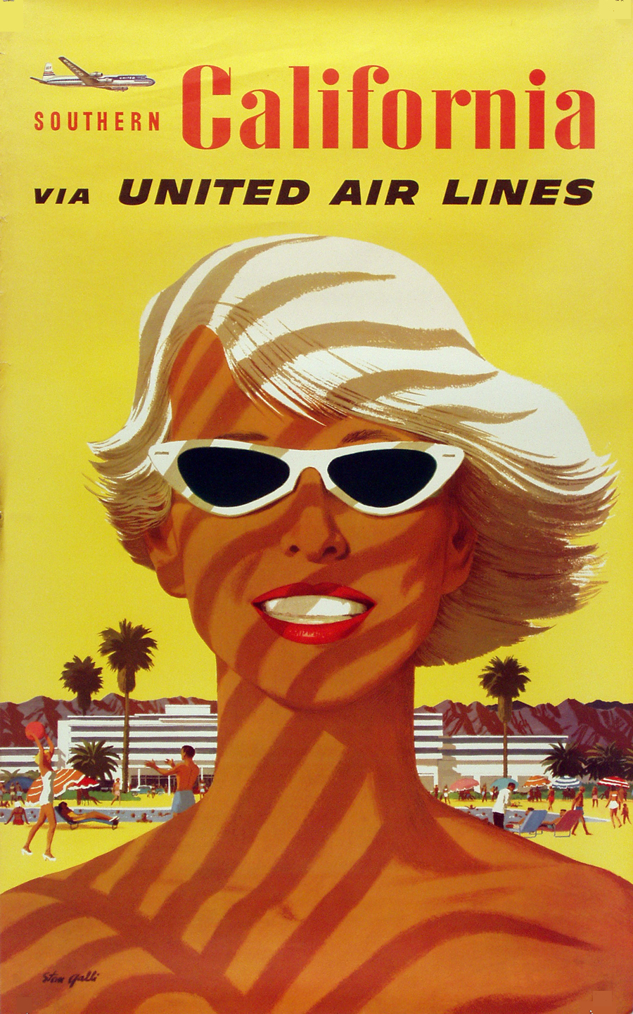
I love so much about the poster. The texture of the gold background, the silhouetted palm trees, the bikini-and-sunglass clad perfectly-tanned-blonde woman (off to the pool no doubt), and the way her entire pose suggests motion. It's a statement about relaxation while at the same time suggesting action and life. We get a variation on the same theme here in a more general Southern California poster. 

Southern California via United Airline by Stan Galli

Los Angeles has been a stop for United Airlines since as far back as 1933. The airline also had stops in San Francisco and Seattle. This North-South route would go West-East from San Francisco to Salt Lake City to Chicago to New York. 


I love the moments when one form of technology overlaps with another. In this case we see an air route named the way train routes were. No one taking the cross coast trip today would think to call it "The Hollywood" but there it is in all its glory. The flight lasted eight and a half hours, which we've gotten down to about five hours these days. Passengers were served stuffed squab and filet mignon (on an airplane, imagine!) . 

The Southern California poster looks to be earlier than the Los Angeles poster with a smaller United Air Lines word mark. Between 1954 and 1961 that squashed sans-serif italic font was used, and then in 1961 when United merged with Capital Airlines the switch to Helvetica was made. It's interesting that pre-1960 posters seem to always use Southern California (in this example with Southern in much smaller print). Then the Dodgers moved west in 1959 and suddenly Los Angeles was sellable all on its own. 

Disneyland - United Air Lines

Of course, selling Los Angeles and Southern California vacations goes hand in hand with Disneyland. This looks to be from the same era as the Los Angeles poster, and the ride depicted is the world famous Jungle Cruise with Sleeping Beauty's castle in the background. 

United was the official airline of Disneyland (as the poster indicates), but the airline sponsored the Enchanted Tiki Room not the Jungle Cruise. The Tiki Room opened in 1963, and was sponsored by United for their first 12 years after which Dole became the title sponsor (and still is). Not only did United get to associate with Disneyland and Los Angeles, but the Tiki Room allowed them to associate with another popular 60s destination: 


Other posters from the 1960s era series: 
No wonder Seattle had a World's Fair and built the Space Needle in the 60s, it was still getting regionalized on travel posters.


The easiest way to age the posters is to look at the A in Air Lines. The 60s era posters have the pointy A of Helvetica, while the previous generation's A has a flat top (look at the Southern California poster as an example). Here are some examples of the earlier posters. Not sure how many of either set were the work of Stan Galli, but there is a consistent look to both eras: 


Wednesday, January 30, 2013

Philippe's

Photo collection LAPL

The Chew today paid a visit to one of my favorite restaurants in Los Angeles, Philippe's. The originator of the French Dip sandwich, the legend goes that when making a sandwich for a fireman named French, the top bun fell into the au jous, and the fireman took it anyway. The next day he came back with a whole bunch of buddies wanting to try this fantastic accident.


Just off Ceasar Chavez Blvd (which becomes Sunset) near Union Station, Olvera Street, and Chinatown it's an essential part of any stop in downtown Los Angeles. It's also a favorite before or after a Dodger game, with the stadium just up the road on Sunset.

When Anthony Bourdain visited Phillipe's with the LA roller derby girls, they told him the lamb is the best, though the roast beef is the standard. Either are fantastic, but it's the atmosphere that sells Phillipe's for me more than anything. There's still sawdust on the floor (a preventative mess that makes spills easier to clean up) and the cigarette counter has been converted to candy and merchandise sales. Coffee was still a dime up until a year ago, and it's still cash only.

Yay Philippe's!