
Photo collection LAPL
Mad Men has often inspired me to take a look into the past, and it's no different with the upcoming final season. The trailer is all about the Mad Men characters embracing the Jet Set age with a psychedelic flourish, and that has inspired me to try and see that era through the medium Mad Men has as its center - advertising.
Mad Men is set in the golden age of advertising, an era that directly corresponds to the creation of the Helvetica font. This sans-serif typography was released in 1957 by the Haas Typefoundry and designed by Swiss designer Max Miedinger. The font was supposed to be neutral with great clarity and no intrinsic meaning. Perfect, then, for an era of magazines, television, and vacation travel.

Helvetica print ad
This is relevant information when trying to date travel posters. The destination art from the 60s is full of Helvetica, and then in the 70s the art starts to take on hippie influences. The poster art of the 60s is a bit more classic color pencil. Go back to the Clipper plane era and you lose the Helvetica. Now, let's take a look at some travel art.

United Air Lines - Los Angeles by Stan Galli 1960
This is the poster that inspired this entire post. Stan Galli is a well known artist who lived to the ripe old age of 97. He went to art school in San Francisco and Los Angeles, and starting in 1952 did illustrations for the Saturday Evening Post.
I love so much about the poster. The texture of the gold background, the silhouetted palm trees, the bikini-and-sunglass clad perfectly-tanned-blonde woman (off to the pool no doubt), and the way her entire pose suggests motion. It's a statement about relaxation while at the same time suggesting action and life. We get a variation on the same theme here in a more general Southern California poster.
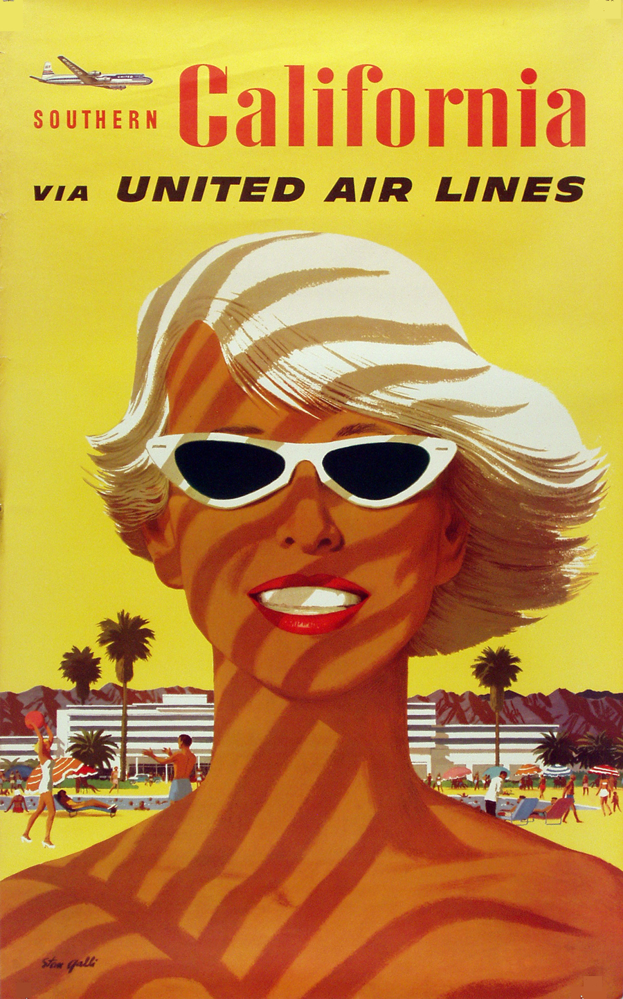
Southern California via United Airline by Stan Galli
Los Angeles has been a stop for United Airlines since as far back as 1933. The airline also had stops in San Francisco and Seattle. This North-South route would go West-East from San Francisco to Salt Lake City to Chicago to New York.

I love the moments when one form of technology overlaps with another. In this case we see an air route named the way train routes were. No one taking the cross coast trip today would think to call it "The Hollywood" but there it is in all its glory. The flight lasted eight and a half hours, which we've gotten down to about five hours these days. Passengers were served stuffed squab and filet mignon (on an airplane, imagine!) .
The Southern California poster looks to be earlier than the Los Angeles poster with a smaller United Air Lines word mark. Between 1954 and 1961 that squashed sans-serif italic font was used, and then in 1961 when United merged with Capital Airlines the switch to Helvetica was made. It's interesting that pre-1960 posters seem to always use Southern California (in this example with Southern in much smaller print). Then the Dodgers moved west in 1959 and suddenly Los Angeles was sellable all on its own.

Disneyland - United Air Lines
Of course, selling Los Angeles and Southern California vacations goes hand in hand with Disneyland. This looks to be from the same era as the Los Angeles poster, and the ride depicted is the world famous Jungle Cruise with Sleeping Beauty's castle in the background.
United was the official airline of Disneyland (as the poster indicates), but the airline sponsored the Enchanted Tiki Room not the Jungle Cruise. The Tiki Room opened in 1963, and was sponsored by United for their first 12 years after which Dole became the title sponsor (and still is). Not only did United get to associate with Disneyland and Los Angeles, but the Tiki Room allowed them to associate with another popular 60s destination:

Other posters from the 1960s era series:


No wonder Seattle had a World's Fair and built the Space Needle in the 60s, it was still getting regionalized on travel posters.


The easiest way to age the posters is to look at the A in Air Lines. The 60s era posters have the pointy A of Helvetica, while the previous generation's A has a flat top (look at the Southern California poster as an example). Here are some examples of the earlier posters. Not sure how many of either set were the work of Stan Galli, but there is a consistent look to both eras:


No comments:
Post a Comment